Guide
Trend and Time Series Analysis in Excel Using AI
Analyze trends, detect seasonality, and forecast demand from Excel data without pivot tables, formulas, or separate forecasting tools.
Introduction
Most clinics do not struggle with collecting data. They struggle with understanding it in time.
Patient demand spikes unexpectedly. Medications run low. Staffing falls behind.
Not because the data is missing, but because the trends are not visible early enough.
Trend and time series analysis helps uncover how key metrics evolve over time, so decisions can be made before problems occur.
Traditional Excel workflow
To analyze trends in Excel, analysts typically:
- group data by time, such as month, week, or day
- build pivot tables for aggregation
- create charts manually
- interpret patterns by inspection
- use separate tools for forecasting
This process takes hours, requires multiple tools, and breaks easily as the data grows.
With Decide
Decide turns the workflow into a single instruction.
You describe the trends, comparisons, patterns, and forecasts you want. Decide executes the analysis, creates charts, explains what changed, and produces projections you can use for planning.
Scenario
You are a data analyst supporting a hypertension clinic in Nigeria.
The clinic has monthly data in Excel, including:
- number of patient visits
- new patients
- follow-up visits
- medication dispensed by drug type
The data is clean, but no insights have been extracted.
Business objective
The clinic wants to:
- understand how patient demand is changing
- identify which medications will be needed more
- detect peak periods in advance
- improve procurement and staffing decisions
Prompt
Analyze this dataset and provide the following:
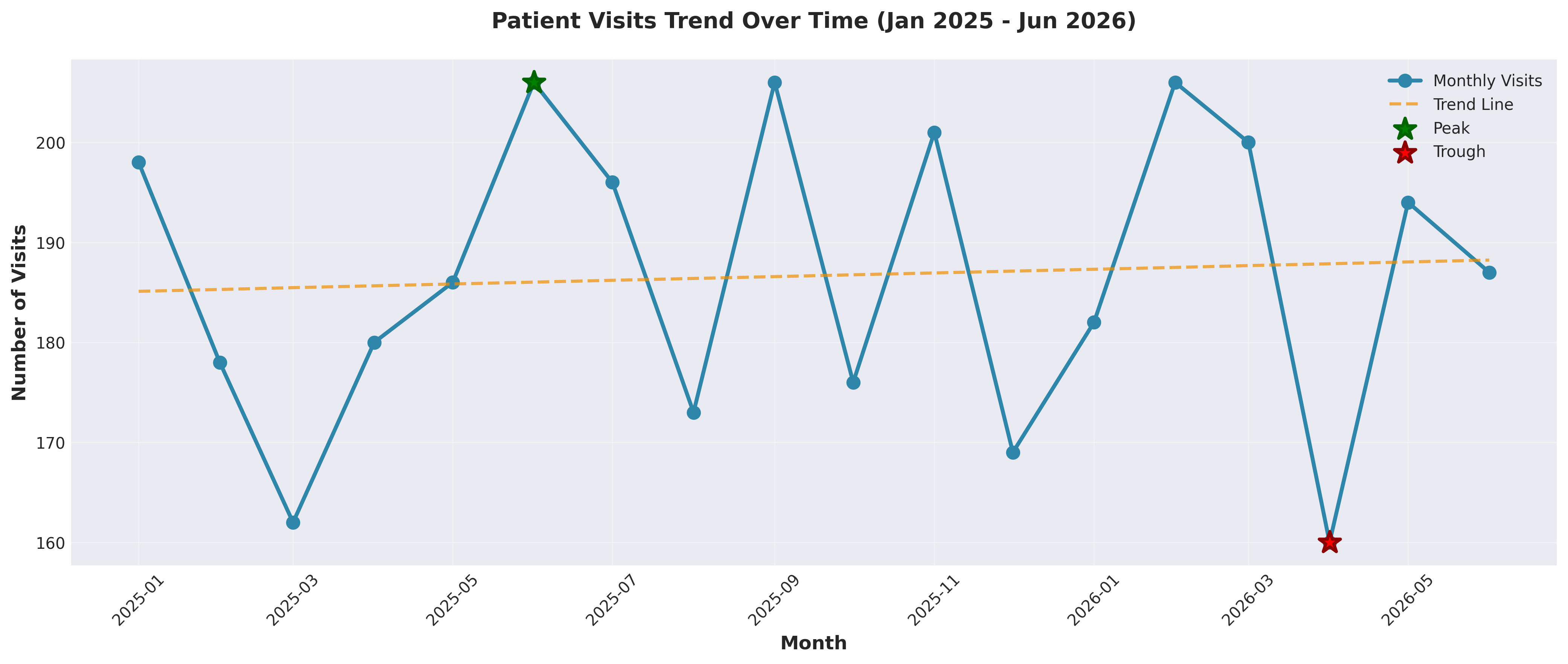
1. Show the trend of Number_of_Visits over time.
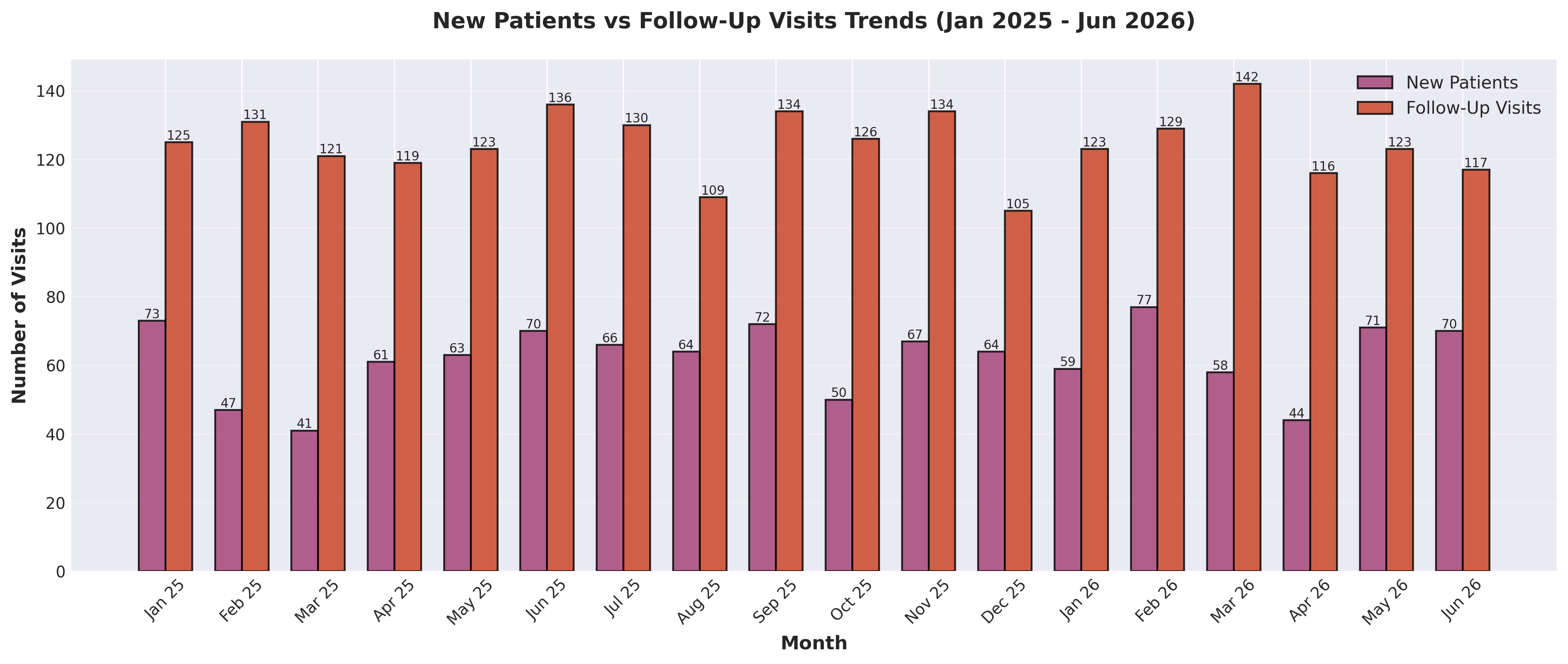
2. Compare trends between New_Patients and Follow_Up_Visits.
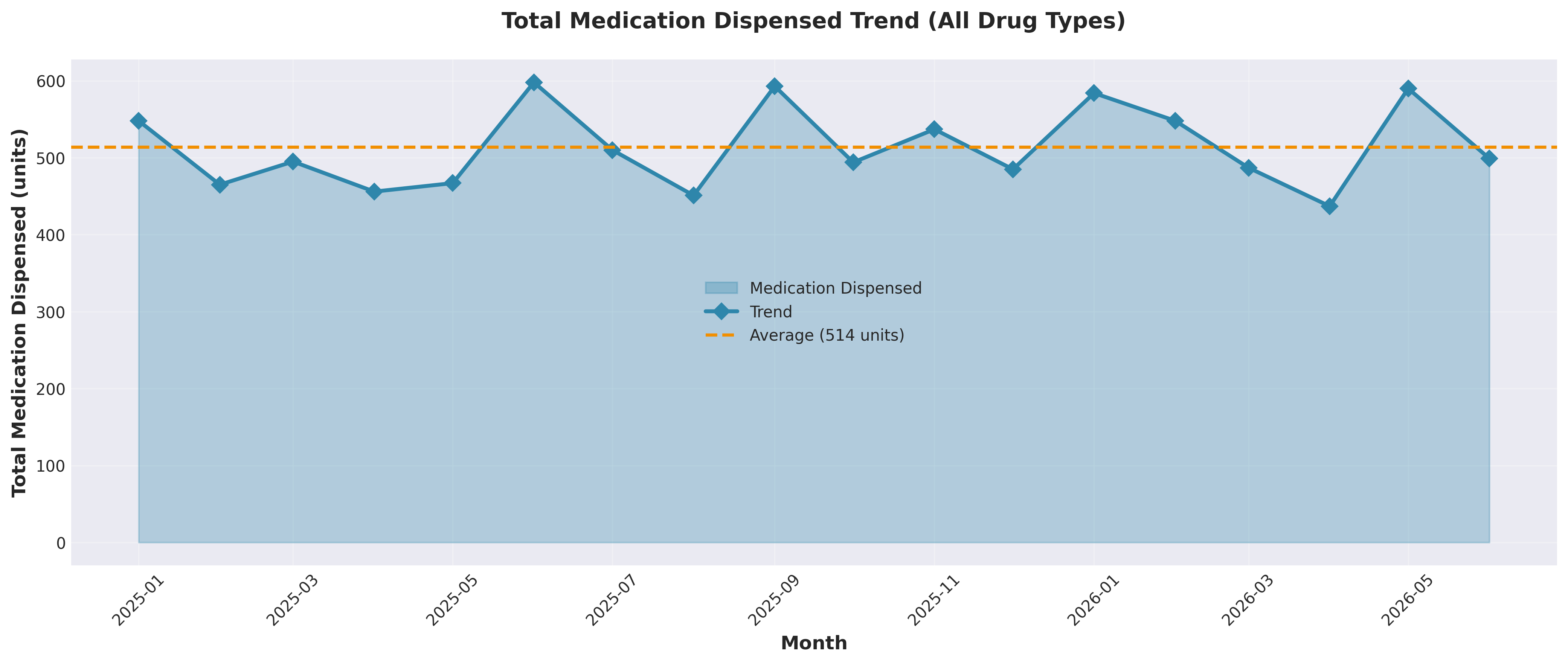
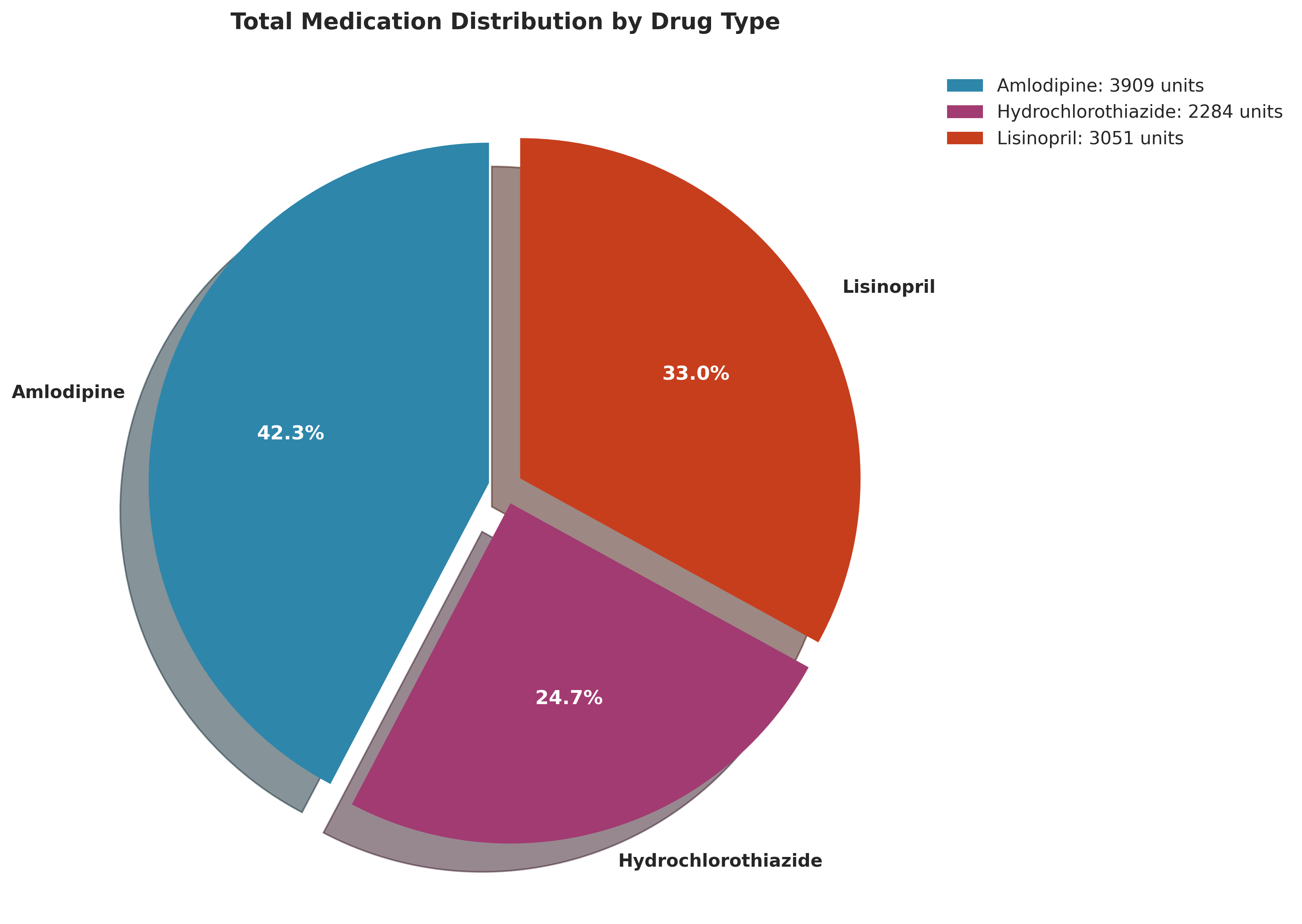
3. Analyze Total_Medication_Dispensed over time.
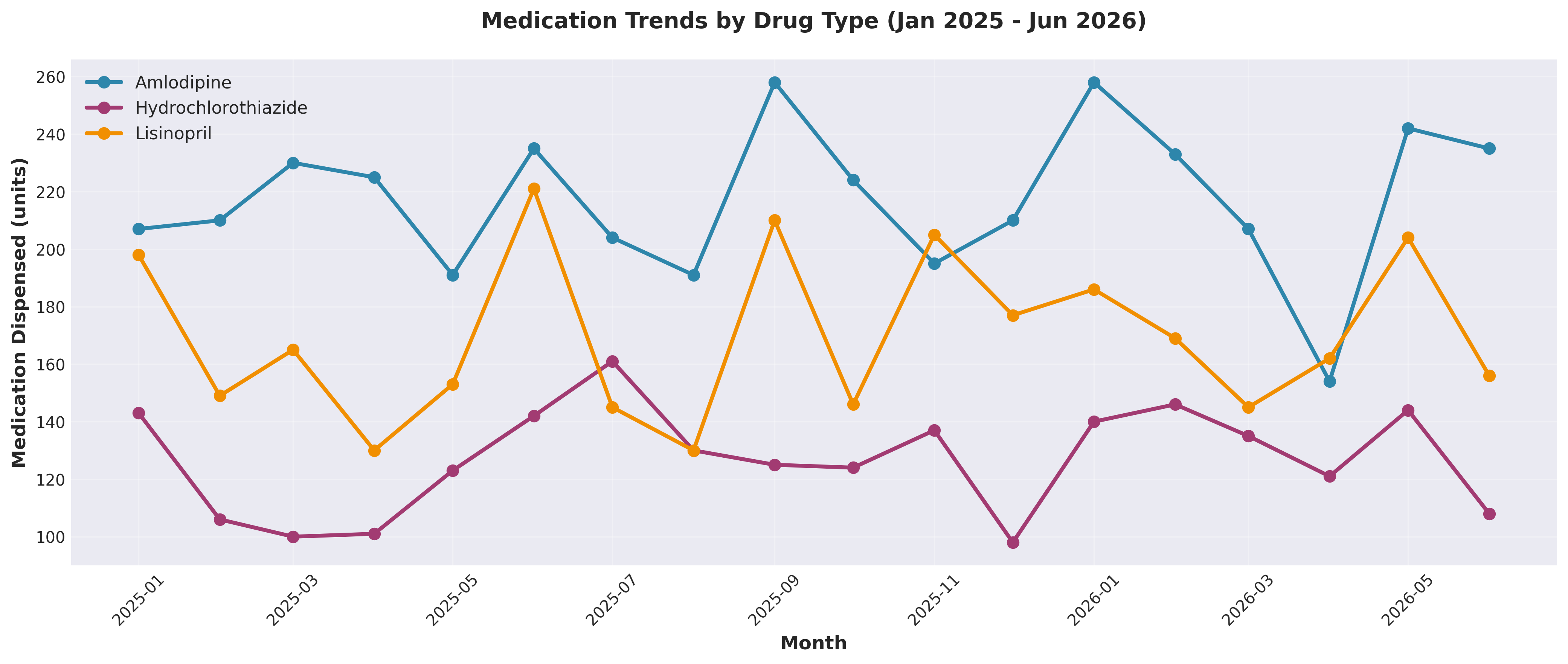
4. Show medication trends by Drug_Type.
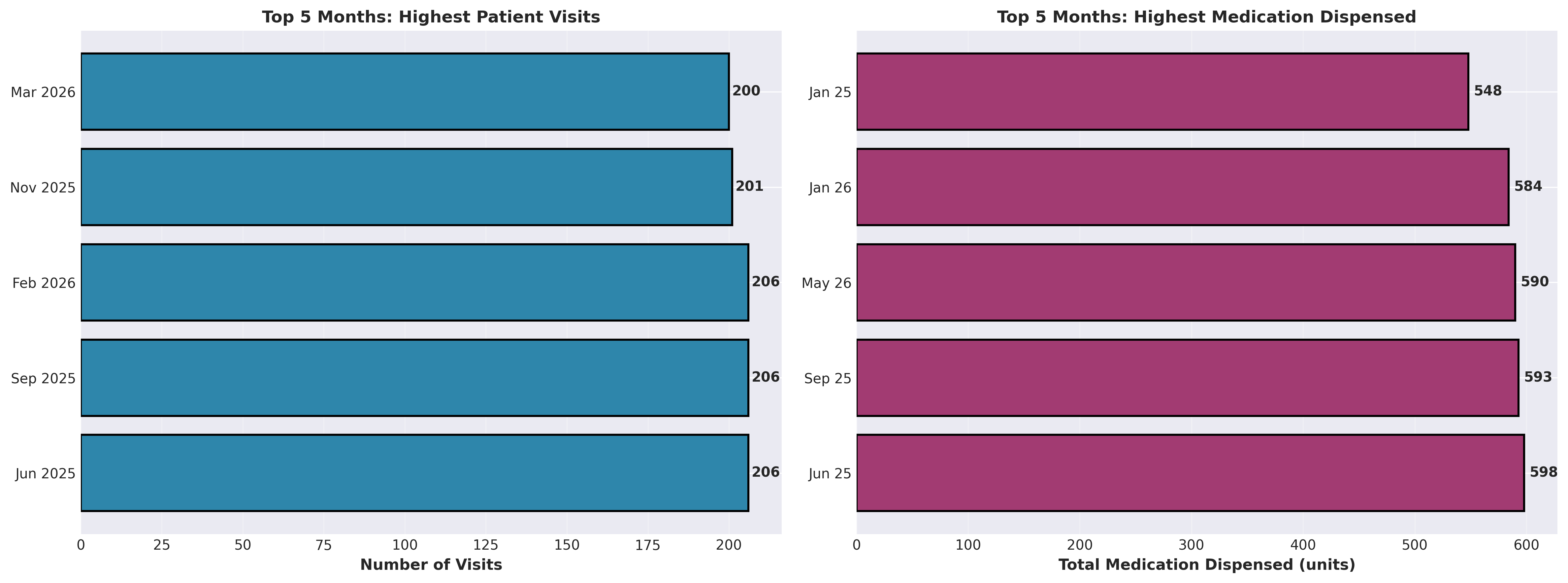
5. Identify peak months with the highest patient visits.
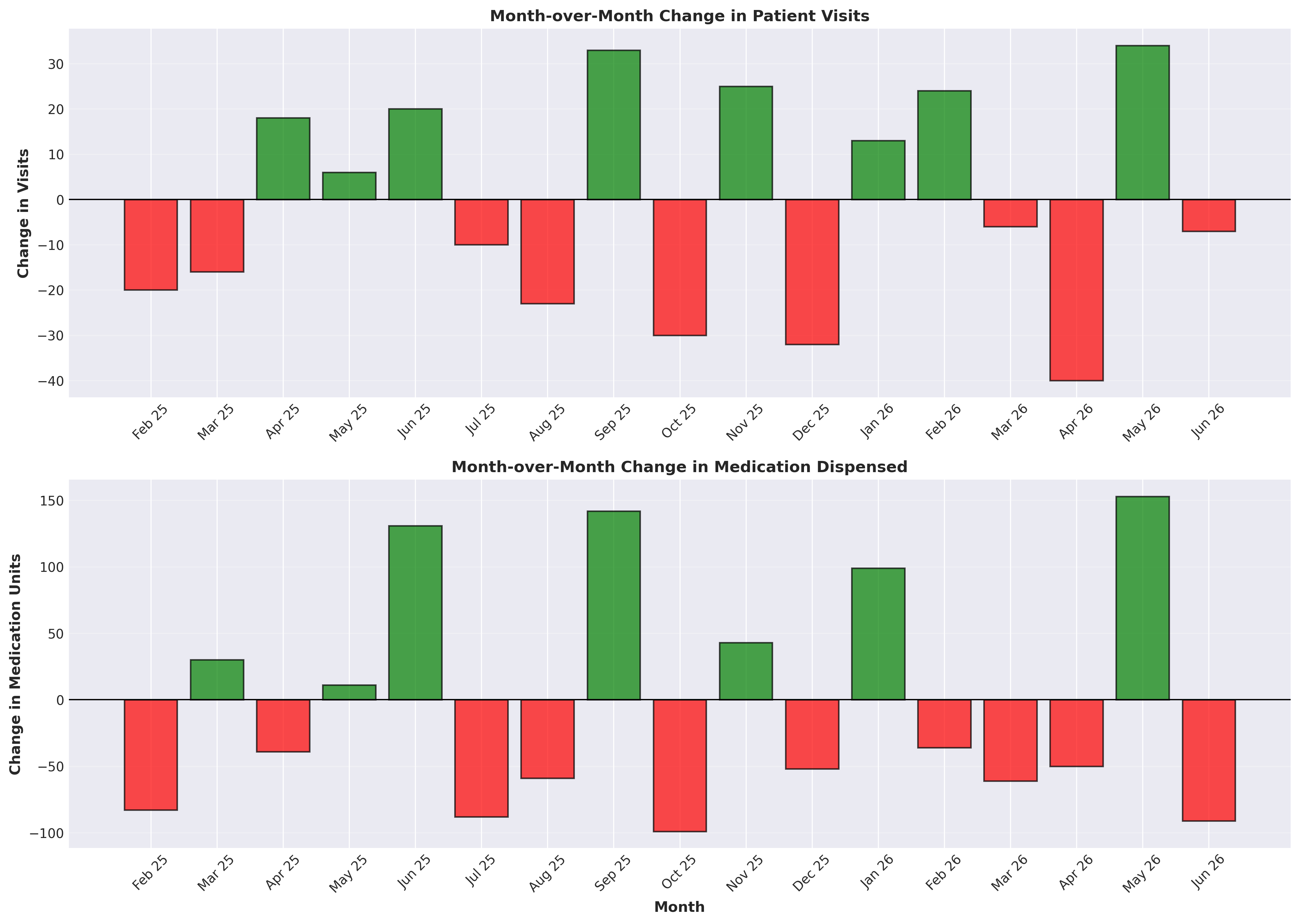
6. Highlight any noticeable patterns or seasonality.
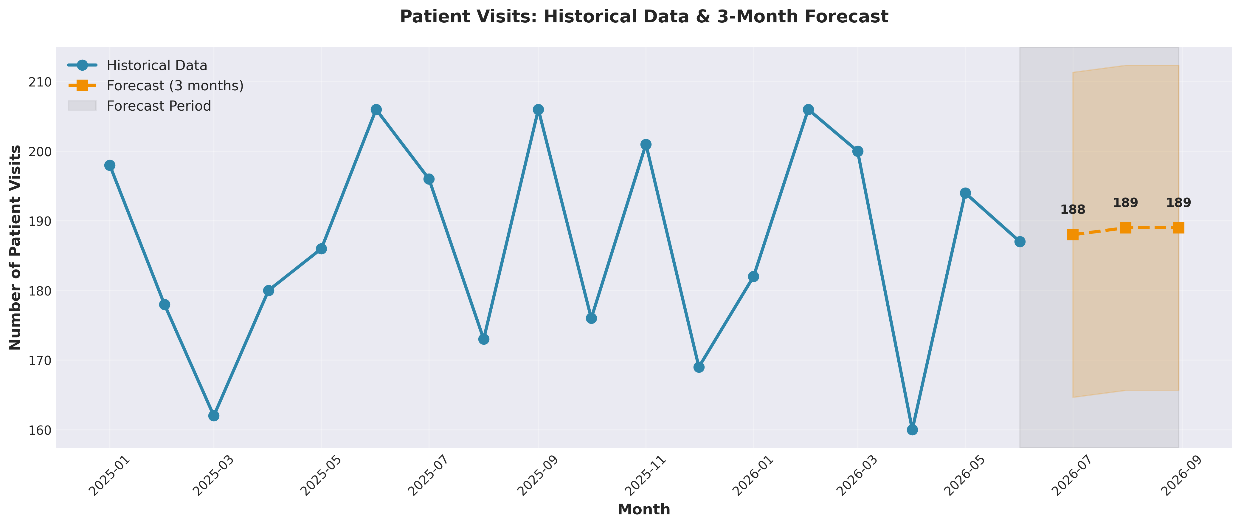
7. Forecast patient visits for the next 3 months.
8. Provide insights that can support decision-making in the clinic.
9. Present the results clearly with explanations.What Decide produces instantly
Decide can generate:
- a time-series chart showing patient visit growth over time
- a clear comparison of new versus returning patients
- medication demand trends broken down by drug type
- identification of peak months and seasonal spikes
- detection of recurring patterns in patient flow
- a 3-month forecast of patient visits
- estimated future medication demand
- written insights for decision-making
What this enables
Instead of only analyzing data in Excel, the clinic can answer:
- When will patient demand spike next?
- Which drugs are likely to run out soon?
- Are we seeing more new patients or repeat visits?
- How should staffing change next quarter?
Example outputs
What the analysis looks like
These are the charts Decide generated from the clinic dataset. Each one maps to a decision the clinic needs to make: demand, staffing, medication planning, forecasting, and quality review.
Demand trend
Start with patient demand
Decide first turns monthly visits into a readable trend, making it clear where demand is stable, where it peaks, and where the clinic should watch for dips.
Patient mix
Compare new patients with follow-up visits
The next view separates acquisition from continuity of care, so the clinic can see whether growth is coming from new patients or returning patients.
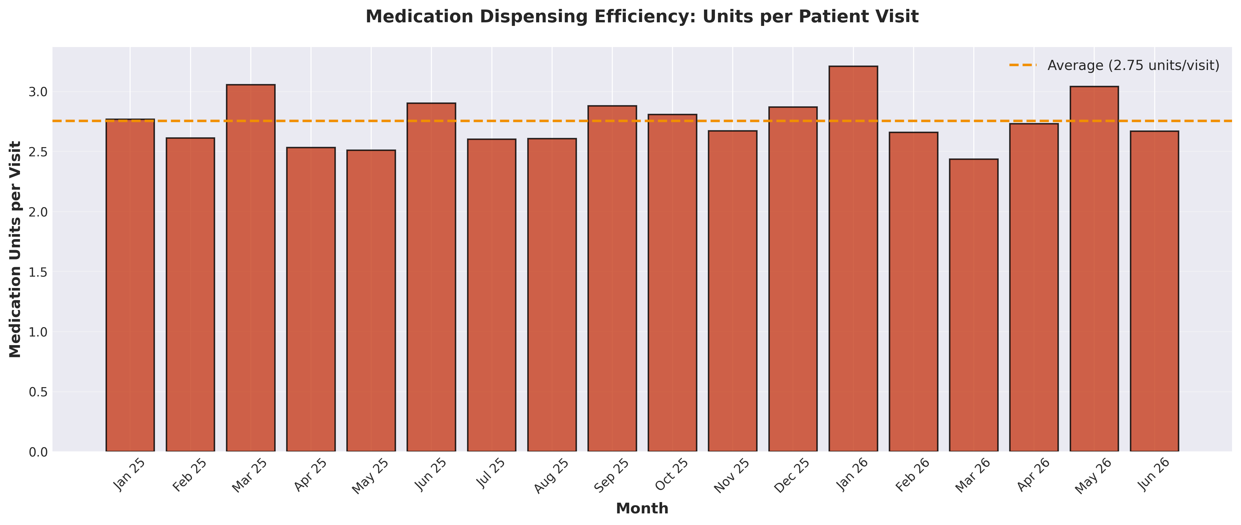
Medication demand
Connect patient demand to medication planning
Decide then connects visits to medication volume, both in aggregate and by drug type, so procurement decisions are tied to the actual operating pattern.
Planning signal
Identify peak months and forecast what comes next
The forecast view turns the historical trend into a planning input. Instead of reacting after demand moves, the clinic can prepare staffing and inventory in advance.
Operating quality
Review movement and efficiency
Finally, Decide adds operational checks that help validate the output before a team acts on it.
Output review
After running the analysis, verify that:
- trends are smooth and realistic, with no unexplained spikes
- new patient and follow-up trends align with total visits
- drug trends reflect expected variation
- peak months are correctly identified
- forecast values are reasonable and not extreme
Forecasts should support planning, not replace judgment. If the source data has gaps, sudden one-off events, or inconsistent date formatting, those issues should be reviewed before acting on the forecast.
Why use Decide
Decide is useful for this workflow because it:
- removes the need for pivot tables, formulas, and manual charting
- automatically detects patterns that may be easy to miss
- combines analysis, visualization, and explanation in one run
- generates forecasts without requiring you to build models manually
- turns raw Excel data into decisions faster
End goal
The goal is to turn historical Excel data into:
- clear trends
- predictable patterns
- actionable forecasts
That way, decisions are made ahead of demand, not after problems occur.
Closing
Instead of spending hours building charts and models in Excel, you ask once and get the analysis, forecast, and decision support in seconds.
Get started today with Decide
Related guides
Forecasting
How to Build a Revenue Forecast and Scenario Model in Excel with AI
Build a driver-based 6-month revenue forecast with base, best-case, and worst-case scenarios directly in Excel.
Valuation
DCF Valuation in Excel Using AI
Turn revenue projections into a full DCF model with assumptions, discounted cash flows, terminal value, and enterprise value.
Pricing
How to Create a Profit Margin and Pricing Model in Excel with AI
Create a pricing model with profit, margin, break-even analysis, and scenario testing without building the formulas manually.